Creating visually engaging slide decks has evolved far beyond using standard office templates and wall of text layouts. Short video platforms have become massive creative hubs where graphic designers, students, and corporate communicators share innovative slide tricks that capture audience attention immediately. These visual tutorials demonstrate how smooth transitions, clever typography, and interactive layouts transform boring slides into memorable storytelling tools. Learning these modern slide design techniques helps presenters stand out in classrooms, boardrooms, and client meetings while keeping viewers focused from start to finish.
Mastering the Morph Transition for Seamless Storytelling
One of the most celebrated slide design techniques shared by digital creators involves using the Morph transition to create fluid, cinematic movement between consecutive slides. Instead of relying on jarring cuts or outdated wipe effects, the Morph feature automatically animates the position, size, and color of matching objects from one slide to the next. Presenters place an image or text block off the edge of the first slide, duplicate that slide, and move the element into the center of the canvas. When the slideshow plays, the object glides smoothly across the screen like a professionally edited motion graphic video.
This technique works exceptionally well for zooming into detailed maps, rotating product photographs, or smoothly shifting focal points during a complex explanation. Creators frequently demonstrate how scaling a tiny icon on one slide into a full screen background on the following slide builds dramatic visual momentum. Mastering this single transition elevates standard business pitches and school reports into dynamic visual experiences that hold audience attention effortlessly.
Interactive Zoom Menus and Nonlinear Navigation
Traditional slideshows force speakers to click through every single page in a rigid, linear order, which often feels repetitive during longer talks. Viral presentation tutorials showcase how to build interactive dashboard menus using the Slide Zoom and Summary Zoom features. By placing clickable miniature previews of different presentation sections onto a single main hub slide, speakers gain the freedom to jump directly to any topic based on audience questions or time limits.
Clicking on a specific section thumbnail smoothly zooms the camera directly into that chapter, and finishing that segment smoothly zooms back out to the main overview screen. This nonlinear approach transforms a static slideshow into an interactive digital portfolio or modular pitch deck. Audiences appreciate seeing the big picture roadmap early on while enjoying the smooth camera zoom movements between distinct discussion topics.
Split Screen Layouts with Bold Minimalist Typography
Modern presentation aesthetics favor clean, spacious layouts over cluttered bullet points that overwhelm viewers. Designers on short video feeds frequently highlight split screen compositions that divide the slide canvas into two balanced visual zones. One half features a high resolution photograph, subtle video loop, or solid accent color block, while the opposite half displays a concise headline paired with a brief supporting sentence.
Using oversized, bold typography on one side creates strong visual hierarchy and ensures that people sitting in the back of a large room can read every word clearly. Leaving generous empty space around text elements allows the core message to breathe and prevents visual fatigue. This minimalist split layout keeps listeners focused on the speaker rather than squinting to read dense paragraphs on the screen.
Masking Text Inside Moving Background Videos
Adding subtle motion to title slides immediately hooks an audience before the speaker even says a word. Creative tutorials demonstrate how to place high definition background videos behind custom cut out text shapes using the Merge Shapes tool. By subtracting a bold title word from a solid rectangle shape, the presenter creates a transparent window through which an ambient ocean wave, city timelapse, or abstract light gradient plays continuously.
This layered masking effect looks like expensive custom video production work, yet it takes less than two minutes to assemble using native slide tools. Choosing slow, gentle background footage ensures the movement adds atmosphere without distracting viewers from the main title. This technique works wonderfully for opening cover slides, major chapter dividers, and inspirational closing statements.
Floating Three Dimensional Objects and Product Mockups
Flat two dimensional graphics can sometimes make technical presentations feel lifeless, which is why three dimensional model integration has become a trending presentation trick. Slide software supports importing three dimensional objects that presenters can rotate, tilt, and animate across multiple angles. Creators show how combining 3D models with the Morph transition allows a virtual smartphone, architectural building, or anatomical heart to spin smoothly in midair as the speaker explains different components.
Even without dedicated 3D files, presenters achieve a similar floating depth effect by layering transparent PNG images with soft, diffused drop shadows. Placing a subtle blurred shadow underneath an elevated product image tricks the human eye into perceiving physical depth on a flat screen. Adding these dimensional touches makes product launches and scientific explanations feel modern and tangible.
Glassmorphism Cards for Modern Data Display
Inspired by contemporary user interface trends, glassmorphism has rapidly become a favorite aesthetic for displaying statistics, quotes, and key takeaways. This design style mimics frosted translucent glass floating above a colorful gradient or textured background image. Creators build these frosted cards by drawing rounded rectangles, applying a semi transparent white or dark fill, adding a thin glowing border, and layering a soft background blur effect.
Placing key performance numbers or short customer testimonials inside translucent glass panels keeps the text legible while allowing vibrant background colors to shine through softly. This layered aesthetic gives corporate reports and creative portfolios a sleek, polished appearance reminiscent of modern mobile operating systems. Consistent corner rounding and subtle border highlights tie the entire slide deck together cohesively.
Animated Progress Bars and Section Trackers
Long presentations can cause audiences to lose track of how much material remains, leading to restlessness and declining focus. Smart presenters solve this problem by adding slim, animated progress bars along the top or bottom edge of every slide. Tutorials show how placing a thin colored line that grows wider across each consecutive slide gives viewers a subtle visual cue about the presentation timeline.
Paired with the Morph transition, the progress bar stretches seamlessly from left to right as the speaker advances through chapters. Some creators also include tiny milestone markers along the track to highlight major topic shifts. This thoughtful user experience detail respects the audience's time and maintains steady engagement throughout lengthy lectures or training sessions.
Custom Duotone Color Overlays for Photo Consistency
Gathering images from different online sources often results in a mismatched slideshow where photographs clash in lighting, warmth, and color tone. Presentation designers solve this visual inconsistency by applying uniform duotone color washes across every image in the deck. By adjusting picture color saturation and placing semi transparent gradient rectangles over photographs, every visual adopts the exact same brand palette.
For example, bathing all team portraits and office photos in deep navy shadows and vibrant coral highlights immediately unifies the entire presentation. This cohesive color grading makes even basic stock photography look like a custom commissioned editorial shoot. Limiting the slide deck to two dominant brand colors alongside neutral backgrounds ensures visual harmony across dozens of slides.
Kinetic Typography and Word Reveal Sequences
Rather than dumping an entire sentence onto the screen at once, kinetic typography reveals words dynamically in sync with the speaker's vocal pacing. Viral tutorials demonstrate how stacking individual text boxes with staggered fade, fly in, or wipe animations creates rhythmic visual emphasis. When a presenter delivers a key punchline or surprising statistic, the corresponding words appear cleanly on screen at that exact moment.
Keeping animations fast, subtle, and directional prevents the slideshow from feeling gimmicky or slow. Using consistent upward reveals or smooth opacity fades maintains professional polish while guiding the viewer's eye directly to the most important phrase. This synchronized pacing transforms text slides into active visual companions for spoken storytelling.
Creative Timeline Designs with Winding Paths
Presenting company history, project schedules, or historical eras using standard horizontal lines often looks dull and predictable. Creative slide tutorials showcase winding road timelines, curved serpentine paths, and vertical scrolling milestones that guide the viewer's eye naturally across the canvas. Presenters draw smooth curved lines using freeform shape tools and place circular nodes with dates and concise labels along the path.
As the presentation progresses, a glowing highlight dot travels smoothly along the curved track from one milestone to the next using Morph animations. This visual journey turns dry chronological facts into an engaging narrative path. Viewers easily grasp sequence, duration, and key turning points when milestones are arranged along an intuitive visual route.
Layered Paper Cutout Aesthetics for Creative Pitches
When presenting artistic concepts, educational stories, or community initiatives, a tactile paper cutout aesthetic adds warmth and personality. Creators build multi layered scenic backgrounds using curved freeform shapes stacked from foreground to background. Applying soft directional drop shadows to each stacked layer creates the illusion of physical construction paper cut with scissors and arranged inside a shadow box.
Using warm earth tones, pastel palettes, or vibrant sunset gradients enhances the handcrafted paper feel. This charming visual style stands out immediately from sterile corporate templates and sparks curiosity among viewers. It works exceptionally well for storytelling decks, nonprofit pitches, and creative literature summaries.
Interactive Image Carousels for Portfolio Showcases
Showcasing multiple product angles, design mockups, or event photographs on a single slide often leads to cramped collage grids. Viral slide tutorials demonstrate how to construct sleek horizontal image carousels where a central hero photo sits sharply in focus while neighboring images peek in from the left and right edges at smaller sizes.
Advancing to the next slide smoothly glides the carousel strip sideways, enlarging the incoming photograph into the center spotlight while shrinking the previous image to the side. This interactive gallery layout lets speakers showcase dozens of high resolution visuals cleanly without crowding the screen. Audiences enjoy the familiar swipe style motion inspired by modern digital apps.
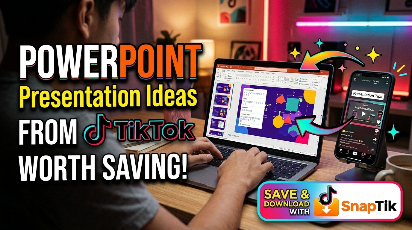
Launch your preferred web browser and go to hTTPs://SnaPTikk.io/
Find a Design Tutorial: Browse your feed for an educational video showcasing a slide animation, typography trick, or presentation layout. Copy its sharing link.
Paste the Link: Return to the website and paste the copied link directly into the input box on the screen.
Download for Reference: Follow the on-screen download options to save the tutorial clip onto your computer or phone so you can watch it offline while building your slides.
Magnifying Glass Spotlight Effects for Detailed Charts
Financial spreadsheets, architectural blueprints, and dense research graphs often contain tiny numbers that viewers struggle to read from afar. Instead of apologizing for small text, smart presenters use a magnifying glass spotlight effect to highlight critical data points. Creators display the full chart dimmed slightly in the background while placing a crisp, enlarged circular cutout of the target metric directly over the relevant area.
As the speaker discusses different trends, the circular spotlight glides smoothly across the chart, illuminating and enlarging each specific figure in turn. This focused visual guidance prevents audiences from getting lost in complex rows of numbers. Listeners immediately understand which data point matters most without feeling overwhelmed by surrounding spreadsheet clutter.
Seamless Panoramic Backgrounds Across Multiple Slides
Breaking free from standard rectangular slide boundaries creates a memorable sense of scale and continuity. Presentation designers achieve this by taking a single extra wide panoramic photograph or continuous vector illustration and spanning it across three or four consecutive slides. Each slide crops a different portion of the wide scene, and applying the Morph transition pans the camera smoothly sideways across the landscape as the speaker talks.
This panoramic panning technique works brilliantly for illustrating interconnected workflows, global supply chains, or expansive historical murals. Rather than feeling like separate isolated pages, the slideshow becomes one continuous canvas that unfolds gradually. Viewers experience a cohesive sense of space and progression that keeps visual interest high.
Minimalist Data Visualization with Custom Icon Arrays
Standard pie charts and default bar graphs often fail to convey the human scale behind compelling statistics. Creative tutorials recommend replacing generic chart bars with proportional icon arrays or visual silhouettes. For instance, instead of displaying a plain text note stating that seventy percent of users prefer mobile access, presenters arrange ten clean smartphone icons in a row and highlight seven of them in a bright accent color.
Visualizing percentages through tangible icons helps audiences grasp proportions instantaneously without doing mental math. Keeping chart labels clean, removing unnecessary gridlines, and highlighting only the primary takeaway number turns dry statistics into persuasive visual evidence.
Dynamic Text Behind Subject Portrait Compositions
Inspired by modern magazine covers and video thumbnails, placing bold headline text partially behind a person's portrait adds striking editorial flair. Creators achieve this layered composition by duplicating a photograph, removing the background from the top copy using built in background removal tools, and sandwiching a large bold title between the original background photo and the foreground cutout subject.
When combined with subtle zoom animations, the headline text slides smoothly upward from behind the subject's shoulders as the slide opens. This depth layering technique makes speaker introductions, team leadership slides, and biographical profiles look remarkably dynamic and professionally designed.
Dark Mode Neon Accent Themes for Tech Presentations
While white slide backgrounds remain common in brightly lit rooms, dark mode presentations featuring deep charcoal or midnight navy canvases have surged in popularity. Dark backgrounds reduce screen glare, make vibrant photography pop vividly, and give technology or gaming presentations a sleek contemporary edge. Creators pair dark matte surfaces with luminous neon cyan, electric purple, or warm amber accents to draw attention to key headlines and chart lines.
Using dark mode themes effectively requires maintaining high contrast between text and background surfaces so words remain sharp and readable. Adding subtle radial glow gradients behind central icons or product renders creates an atmospheric studio lighting effect that captivates audiences in darkened auditoriums and virtual video calls alike.
Tactile Sticky Note Brainstorming Boards
When sharing workshop summaries, creative strategies, or early project concepts, arranging ideas on a virtual corkboard or whiteboard canvas feels authentic and approachable. Viral slide tips show how to design realistic sticky notes with slight rotation angles, soft curled corner shadows, and handwritten style fonts. Grouping color coded notes under neat category headers mimics a collaborative studio brainstorming session.
Animating new sticky notes onto the board one by one as the speaker introduces fresh ideas keeps the audience engaged in the creative process. This informal, tactile layout breaks away from rigid corporate structures and encourages open discussion during team meetings and classroom workshops.
Smooth Curtain Reveal Transitions for Dramatic Openers
Building anticipation before revealing a major announcement, new brand logo, or surprising research finding adds theatrical energy to any presentation. Presenters create custom curtain reveal effects by placing two solid colored panels or textured halves meeting cleanly down the center of the opening slide. Using exit animations or Morph movements, the left and right panels slide smoothly apart toward the screen edges, unveiling the hidden hero visual underneath.
Pairing this visual reveal with a confident pause in speech gives the audience a split second to absorb the central image. This simple mechanical movement turns routine title reveals into memorable focal moments that command attention across the entire room.
Consistent Iconography and Custom Shape Illustrations
Relying on mismatched clip art from random web searches can quickly undermine the credibility of an otherwise well researched presentation. Modern slide tutorials emphasize using unified vector icon sets where every graphic shares identical line thickness, corner radius, and visual style. Presenters customize native geometric shapes by merging circles, rectangles, and triangles into clean custom diagrams that match their exact color scheme.
Consistent visual language across icons, diagrams, and borders signals careful preparation and attention to detail. When every visual element feels intentionally crafted to belong together, audiences naturally place greater trust in the presenter's message and expertise.
Interactive Quiz Slides and Audience Poll Layouts
Transforming passive listeners into active participants keeps energy levels high during educational workshops and training sessions. Creators design engaging multiple choice question slides featuring clean clickable option cards that change color or reveal explanatory badges when selected. Using trigger animations allows speakers to click on any answer choice chosen by the audience and receive immediate visual feedback on screen.
Following each question card with a clean explanation visual reinforces key learning points in a fun, game like format. Incorporating interactive pause points encourages lively discussion and ensures viewers retain core concepts long after the slideshow concludes.
Framed Picture in Picture Speaker Video Layouts
With remote presentations and recorded video lessons becoming standard practice, designing slides that intentionally accommodate the speaker's webcam frame improves visual polish significantly. Smart tutorials demonstrate leaving a dedicated rounded frame or stylized border corner open on every slide specifically sized for the presenter's live camera feed.
Rather than awkwardly covering important text or chart labels with a floating video box, the speaker integrates seamlessly into the slide composition itself. Designing around the live presenter frame creates a cohesive broadcast quality look that elevates online webinars, virtual pitches, and recorded classroom lectures.